UX Designer (Me)
Developers
Founder
Product Manager
How We Revamped GrowthSchool’s Application Form
How We Revamped GrowthSchool’s Application Form
Boosting Revenue and Reducing Drop-Off Rates Significantly
Role
Role
User Interface Design, User Experience Design
Team
Team
Product managers, Program managers
Sales team, Developers, Founder
Tools
Tools
Notion, Figma, Slack
Duration
Duration
2 months
about the company
What is GrowthSchool?
GrowthSchool is an educational platform that offers cohort-based programs designed by industry experts, focusing on practical skills for the modern workforce. It aims to bridge the gap between traditional education and industry demands, providing hands-on learning experiences that directly impact career growth and business success. The startup has more than 100,000 learners and backed by Sequoia Capitals and Owl Ventures
about the problem
Overview
GrowthSchool's application form was experiencing high drop-off rates, negatively impacting both user engagement and business revenue. Users found the form lengthy, confusing, and tedious, leading to incomplete submissions and lost potential customers. This inefficiency prompted the need for a redesign to streamline the process, improve user experience, and increase completion rates, thereby enhancing overall business performance.
The challenge
Understanding the problem
Upon thorough analysis, it became evident that our sales team faced challenges in acquiring accurate customer information. Users frequently inputted incorrect contact details or abandoned the application process midway. Delving deeper into the issue, we recognised a lack of alignment between the questions posed and the diverse user demographics. This discovery sparked a crucial question: How might we streamline the application form to gather accurate data while enhancing the user experience?
“Sales team encountering difficulty in obtaining accurate details.”
“High dropout rates during the form completion process.”
“Users consistently providing incorrect contact details.”
“Questions within the form not tailored to the needs of different user types.”
“Questions within the form not tailored to the needs of different user types.”
“High dropout rates during the form completion process.”
“Sales team encountering difficulty in obtaining accurate details.”
“Users consistently providing incorrect contact details.”
To tackle inaccurate details
Enhancing Data Accuracy with OTP Verification
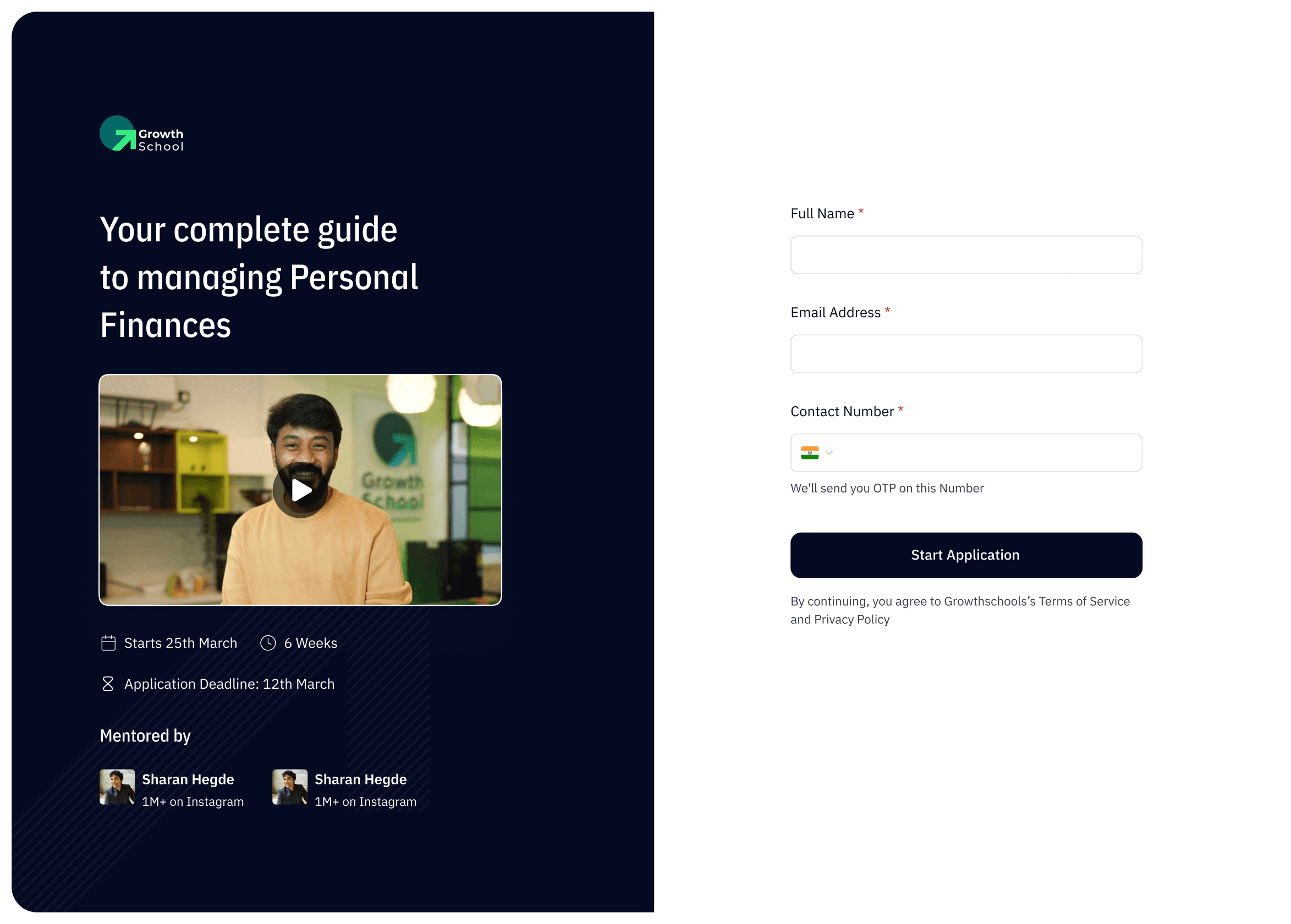
In response to the challenge of obtaining accurate customer information, we devised a strategic solution to integrate OTP (One-Time Password) verification with the contact number field. This innovative approach ensures the validity of contact details provided by users, significantly reducing the incidence of inaccuracies. Additionally, we explored an alternative version of the form, which omitted OTP verification but included informative subtext beneath the contact number field.
To tackle inaccurate details
Enhancing Data Accuracy with OTP Verification
In response to the challenge of obtaining accurate customer information, we devised a strategic solution to integrate OTP (One-Time Password) verification with the contact number field. This innovative approach ensures the validity of contact details provided by users, significantly reducing the incidence of inaccuracies. Additionally, we explored an alternative version of the form, which omitted OTP verification but included informative subtext beneath the contact number field.
Mobile Number *
Enter your mobile number
We'll send you OTP on this Number
Start Application
By continuing, you agree to Growthschools’s Terms of Service and Privacy Policy
Mobile Number *
Enter your mobile number
You will get updates about your application on this number
Start Application
By continuing, you agree to Growthschools’s Terms of Service and Privacy Policy
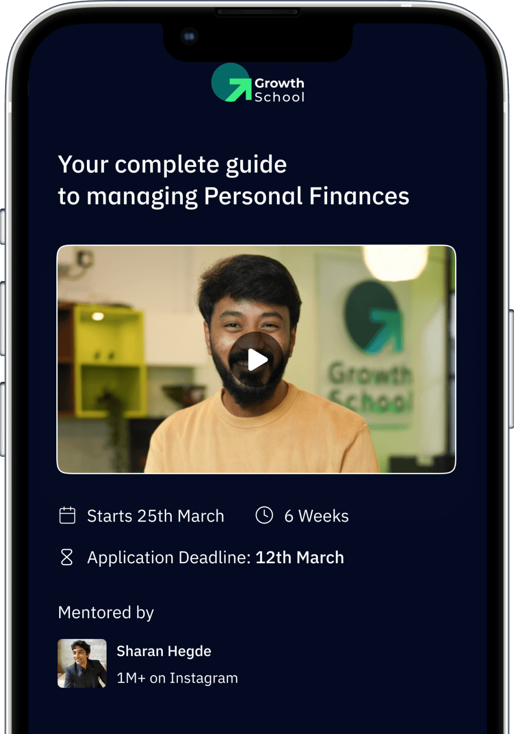

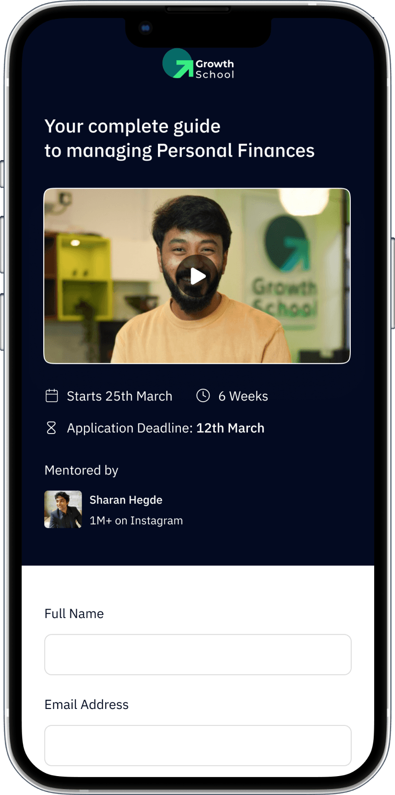
Video Integration in Application Forms
During the user journey mapping process, we observed two primary pathways leading users to our application forms: one through social media ads and the other via our landing page. To enhance user engagement and provide comprehensive information to those arriving directly from social media ads, we strategically integrated video content into our application forms. This video serves as a dynamic tool to inform and guide users, ensuring they have a clear understanding of our programs and offerings right from the outset. By incorporating video integration, we aim to bridge the gap between different entry points and foster a cohesive user experience across all touchpoints.
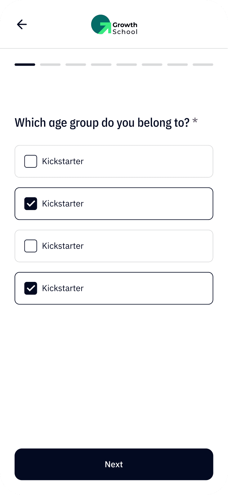
Curbing Drop-off Rates
Personalised Question Approach
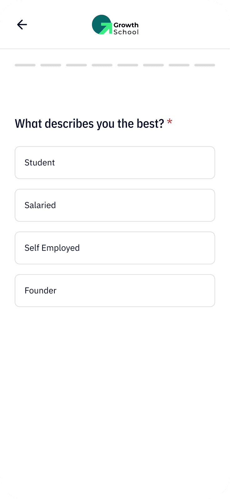
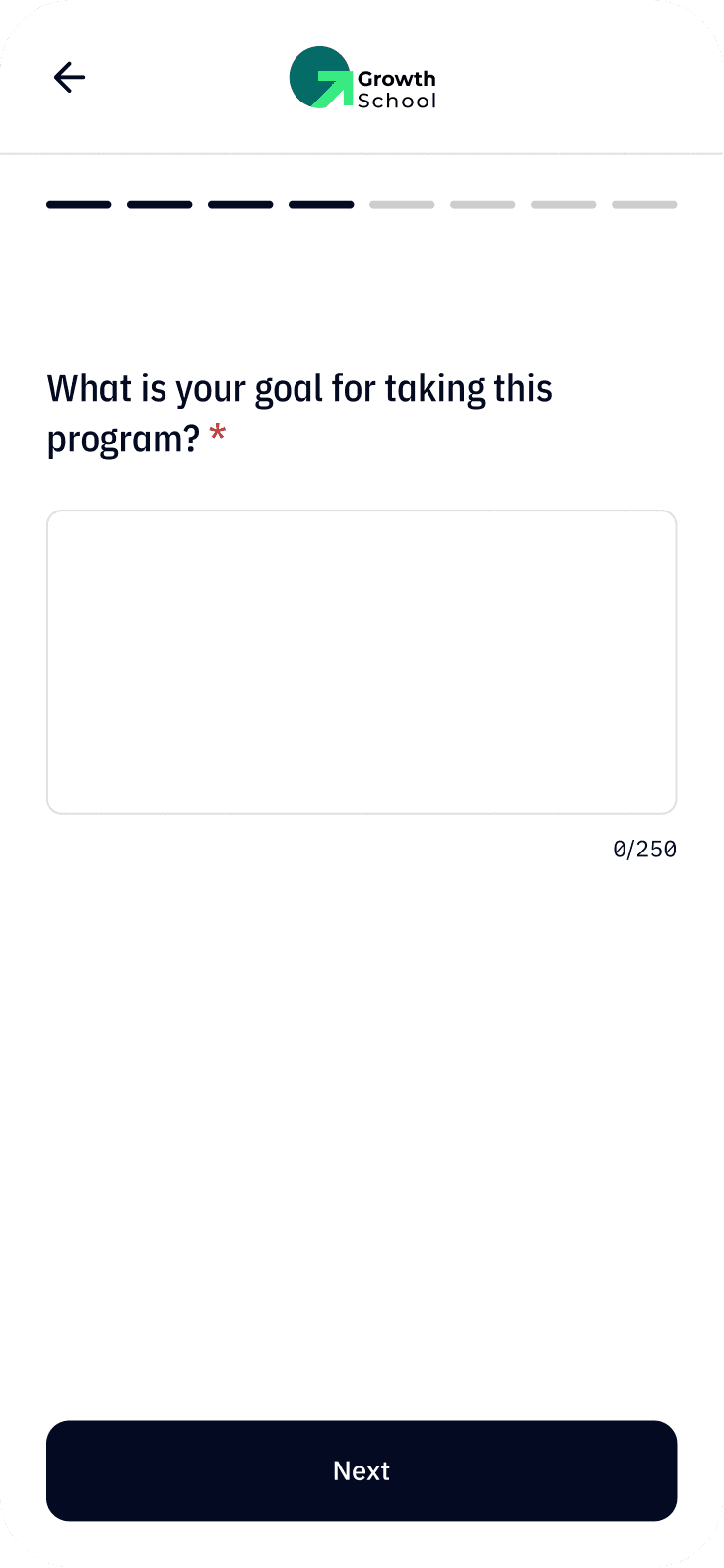
To address high drop-off rates, we adopted a tailored question approach. Collaborating with our sales and marketing teams, we identified four distinct user personas. By personalising form questions to align with each persona's needs, we aim to streamline the application process and reduce dropout rates significantly. The next question dynamically adapts based on the previous answer.
Curbing Drop-off Rates
Personalised Question Approach
To address high drop-off rates, we adopted a tailored question approach. Collaborating with our sales and marketing teams, we identified four distinct user personas. By personalising form questions to align with each persona's needs, we aim to streamline the application process and reduce dropout rates significantly. The next question dynamically adapts based on the previous answer.
Student
Salaried
Self Employed
Founder
Question 1
What describes you the best?
Question 2
What age group do you belong to?
Question 3
link to your LinkedIn profile
Question 4
Goal for taking this program?
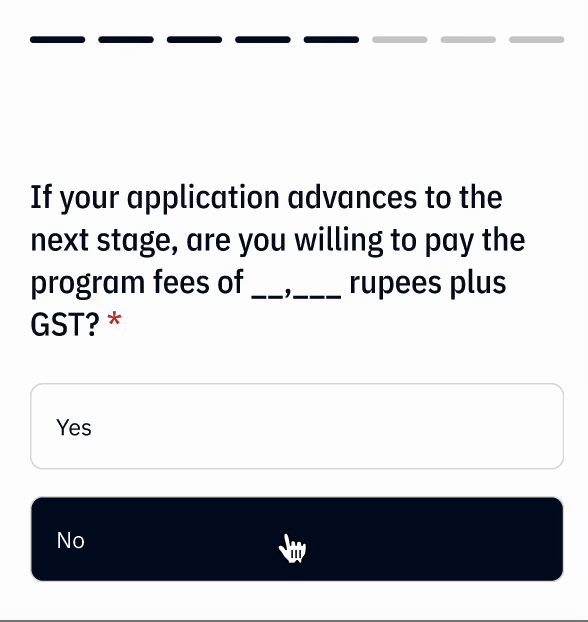
Question 5
Are you willing to pay the fees?
Question 6
Need financial assistance?
Question 7
Why should you be selected?
Question 8
Why do you believe you are a good fit?
Question 9
Where did you get to know about this?
Question 10
Do you have a referral Code?
Learning from Competitors' Strategies
We conducted a thorough evaluation of various form platforms, including Typeform, Google Form, Zoho, Airtribe, and Formstack. After careful consideration, we opted to model our form presentation after Typeform's approach due to its effectiveness in displaying one question at a time. This method allows for a focused and streamlined application process, tailored to our specific needs.
Question screen user interface
I designed a variety of question screens to cover every possible type. These screens are designed to accommodate each type of Standard questions, scholarship questions, Exit questions and Custom questions.
Question screen user interface
I designed a variety of question screens to cover every possible type. These screens are designed to accommodate each type of Standard questions, scholarship questions, Exit questions and Custom questions.
Scholarship Question
Why should you be selected to be part of this cohort of this program?
Min 250 characters
Skip to the latest question
Navigation and Progress Bar Integration
We introduced a "Skip to the latest question" button for streamlined navigation and integrated a segmented progress bar, inspired by Instagram Story-like progression, to enhance user understanding of form completion progress in our redesigned application form
Navigation and Progress Bar Integration
We introduced a "Skip to the latest question" button for streamlined navigation and integrated a segmented progress bar, inspired by Instagram Story-like progression, to enhance user understanding of form completion progress in our redesigned application form
Navigation and Progress Bar Integration
We introduced a "Skip to the latest question" button for streamlined navigation and integrated a segmented progress bar, inspired by Instagram Story-like progression, to enhance user understanding of form completion progress in our redesigned application form
Redesigned Success Screen
I changed the text from the generic “Nice work” to the more informative “Application Submitted” for clarity. To enhance user support, I added a contact email address, allowing users to reach out at any time for questions or issues related to their application or the process. I introduced a Frequently Asked Questions (FAQs) section to provide users with self-help resources and quick answers, reducing the need for direct support contact.
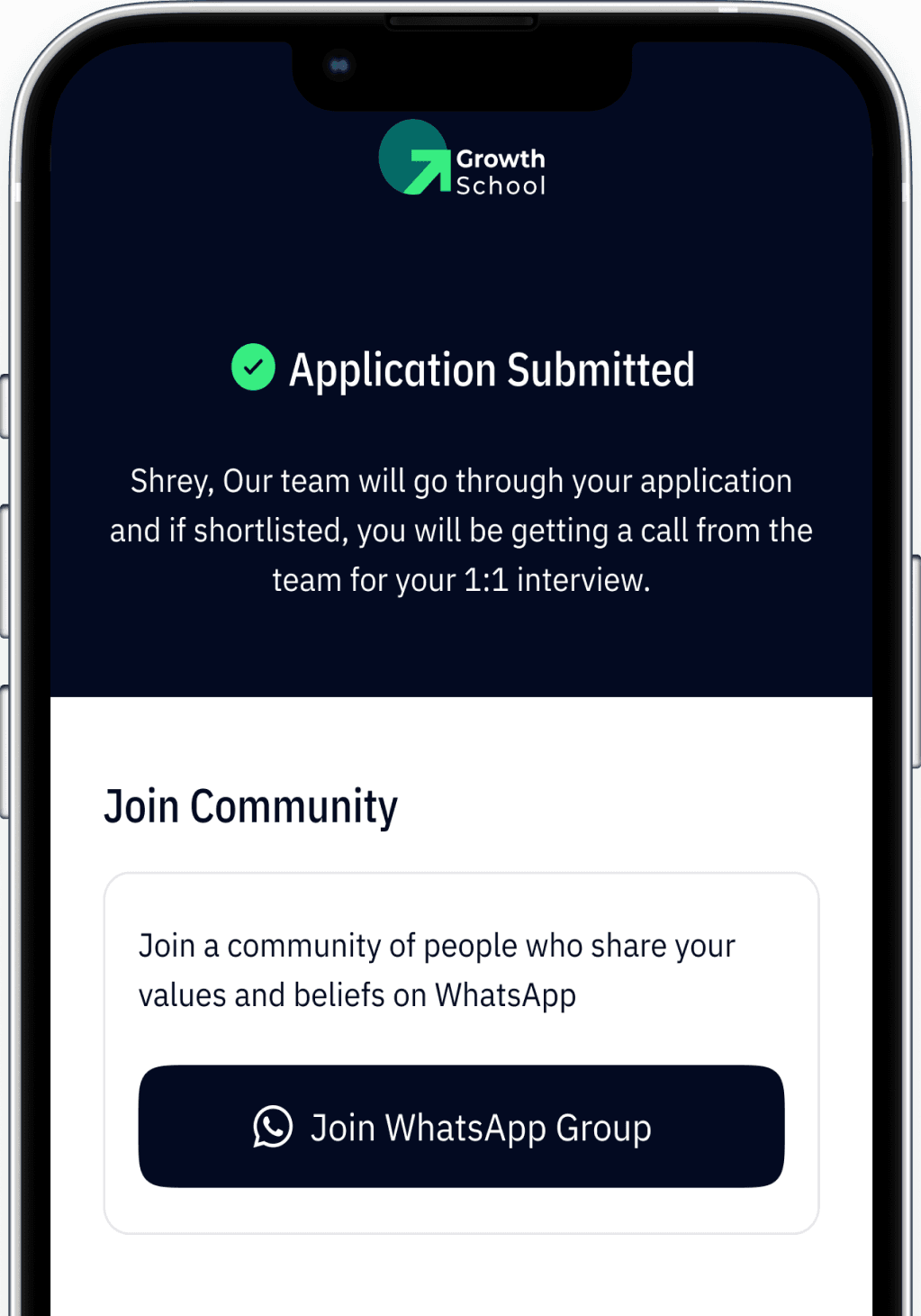
Contact Support
For any queries please mail at hi@growthschool.io
FAQs
If the content is available on the internet, what is the advantage of this course?
These are the best pieces of content available on the topic, put together in a curriculum based structure by an expert in the industry.
If the content is available on the internet, what is the advantage of this course?
If the content is available on the internet, what is the advantage of this course?
Various States
By implementing these various states, I aimed to enhance user experience by ensuring users are always aware of what is happening, whether they encounter an error or are waiting for content to load. This approach minimizes uncertainty and helps maintain user trust and satisfaction throughout their interaction with the system.
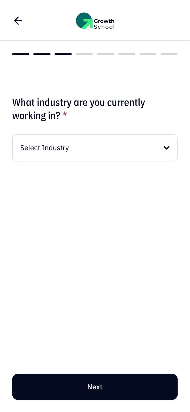
What industry are you currently working in? *
Select Industry
Error screen
This state is activated when something goes wrong during the process. It provides clear messaging to help users understand the issue and offers guidance on how to resolve it. This not only reduces user frustration but also helps in maintaining a smooth user experience.
Error screen
This state is activated when something goes wrong during the process. It provides clear messaging to help users understand the issue and offers guidance on how to resolve it. This not only reduces user frustration but also helps in maintaining a smooth user experience.
Error screen
This state is activated when something goes wrong during the process. It provides clear messaging to help users understand the issue and offers guidance on how to resolve it. This not only reduces user frustration but also helps in maintaining a smooth user experience.
Skeleton State
This state is utilized during loading times. Instead of leaving users staring at a blank screen, skeleton states display a temporary layout that mimics the eventual content structure. This reassures users that the content is being loaded and keeps them engaged by giving them an idea of what to expect.
Accessibility
Ensuring accessibility was a priority throughout the design process. Each element on screen was crafted to follow the WCAG (Web Content Accessibility Guidelines) standards. This adherence guarantees that the application form is usable by individuals with diverse abilities, promoting inclusivity. Key accessibility considerations included: Font Choices: We used IBM Plex Sans and IBM Plex Condensed fonts, chosen for their clarity and readability. Both fonts support a wide range of characters and are designed to be legible at various sizes. Font Sizes: The minimum font size used is 14px, ensuring that text is easily readable by everyone, including users with visual impairments. Color Contrast: All colors used in the design meet at least the AA level of contrast as per WCAG guidelines. This ensures that text and interactive elements are distinguishable against their backgrounds, making the interface usable for people with low vision or color blindness.
Impact
The redesign was successful, resulting in the following impact
Impact
The redesign was successful, resulting in the following impact
60% More deeper insights for sales and marketing team
Enhanced user experience for applicants
15% Increased in business revenue
20% Reduced drop-off rates
20% more accurate contact information for sales people
Increased business revenue